Project: The Creightonian Responsive Platform
Role: UI/UX Designer & Technical Web Lead
Tools Used: Adobe XD, WordPress, Custom HTML/CSS, Elementor, Database Migration Tools
1. The Challenge
The legacy web platform for a college newspaper was functionally obsolete. It lacked essential mobile-responsive layouts, resulting in massive user drop-offs on mobile viewports. Furthermore, over 7,000 historical archives and media files were locked behind a rigid, non-compliant database structure that hindered discoverability and failed basic web accessibility standards.
2. The Process & Methodology
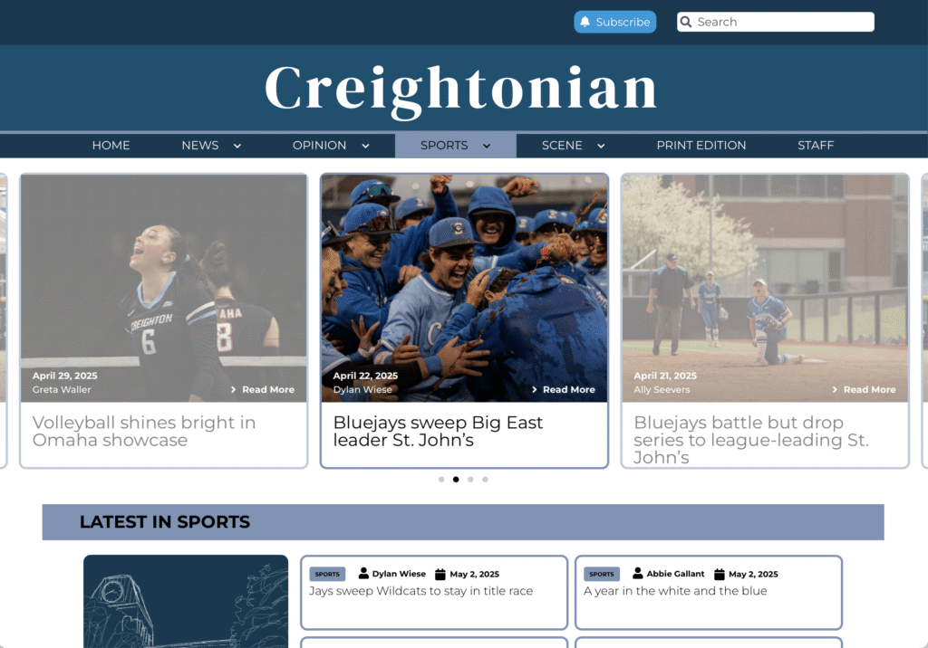
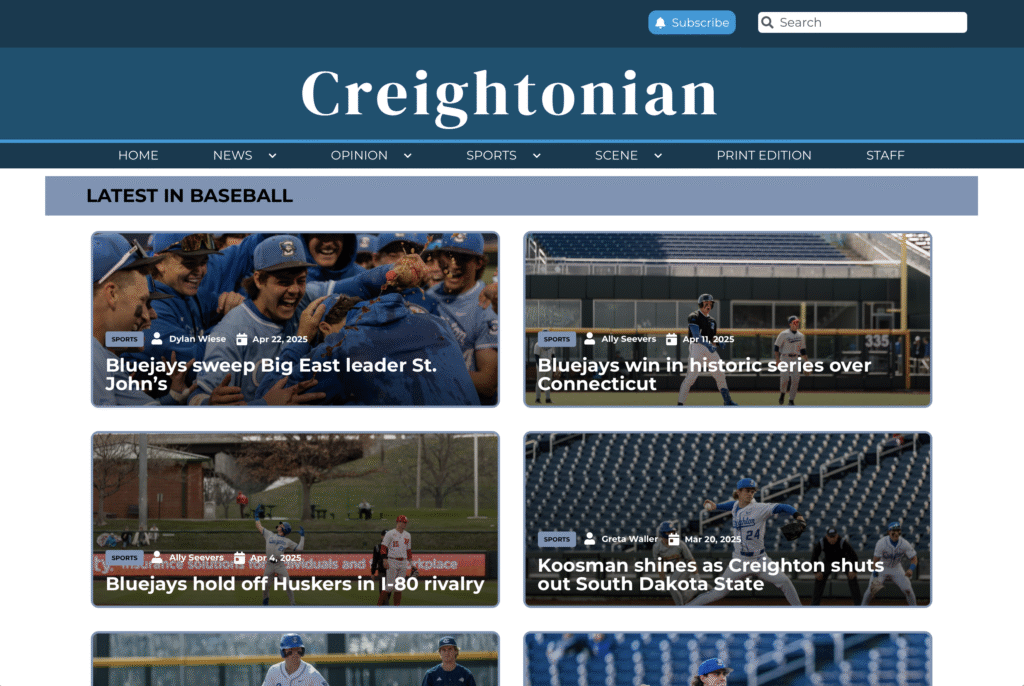
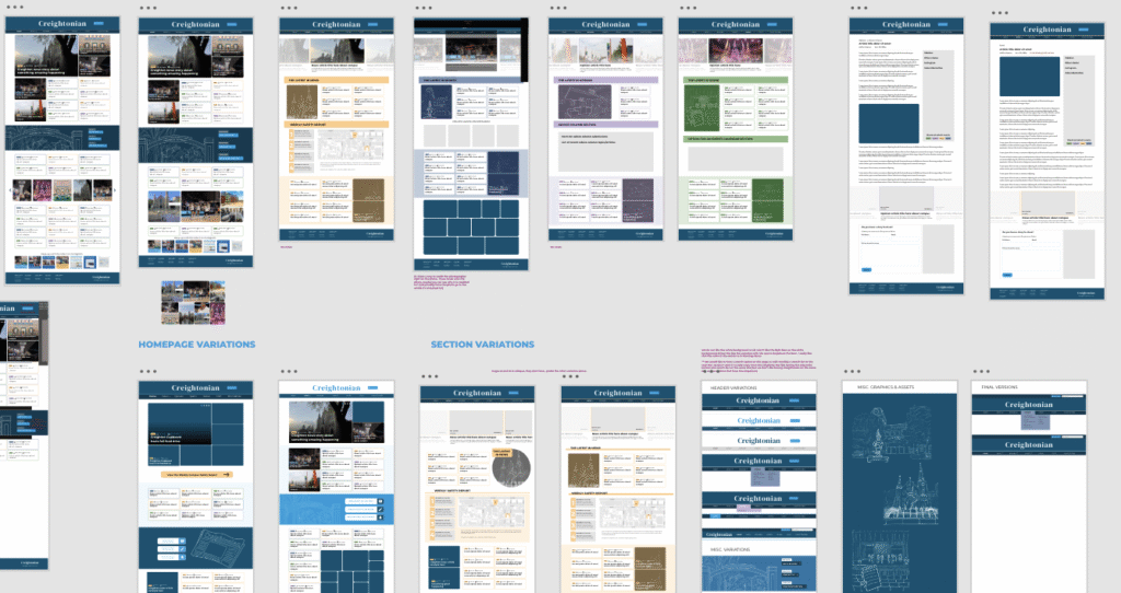
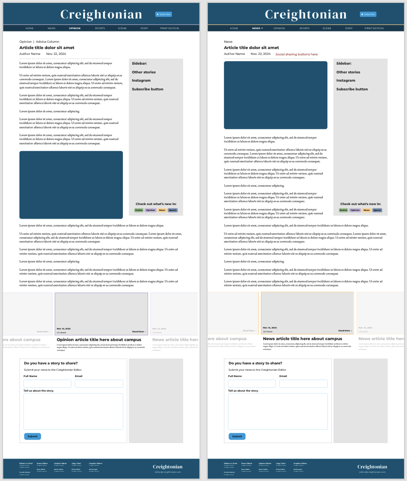
Frontend Execution: Personally translated the high-fidelity wireframes into custom responsive WordPress components, utilizing custom CSS injections to maintain strict structural alignment with the approved designs.
User Journey Mapping: Documented typical reader workflows to determine visual friction points, discovering that a lack of categorical hierarchy severely restricted deep-site navigation.
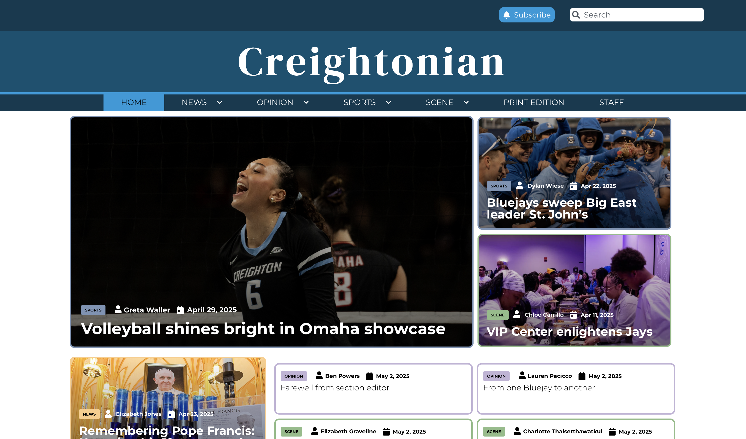
Prototyping: Utilized Adobe XD to wireframe a mobile-first UI layout, modernizing the grid structure, refining the typography scales, and introducing intuitive global navigation.


3. Testing & Compliance
Conducted rigorous pre-launch QA testing, focusing on cross-browser compatibility and responsive behavior. Executed WCAG accessibility audits, implementing critical color contrast and font scalability corrections to ensure all readers could easily digest the content.
4. Business Impact & Outcomes
Delivered a highly flexible, modern interface framework that supported heavy user traffic, resulting in zero post-launch downtime.
Successfully migrated 100% of the 7,000 legacy archives without structural data loss or broken layout instances.